
Your go-to e-commerce checkout optimization guide

Anastasiia Starchenko

Did you know nearly 70% of online customers abandon their carts due to a poor checkout experience?
Ouch.
That’s a staggering amount of revenue slipping through your fingers and something no ambitious e-commerce brand can afford.
Implementing next-gen e-commerce checkout practices simplifies shopping for your customers while ensuring you increase conversion and capture essential order details.

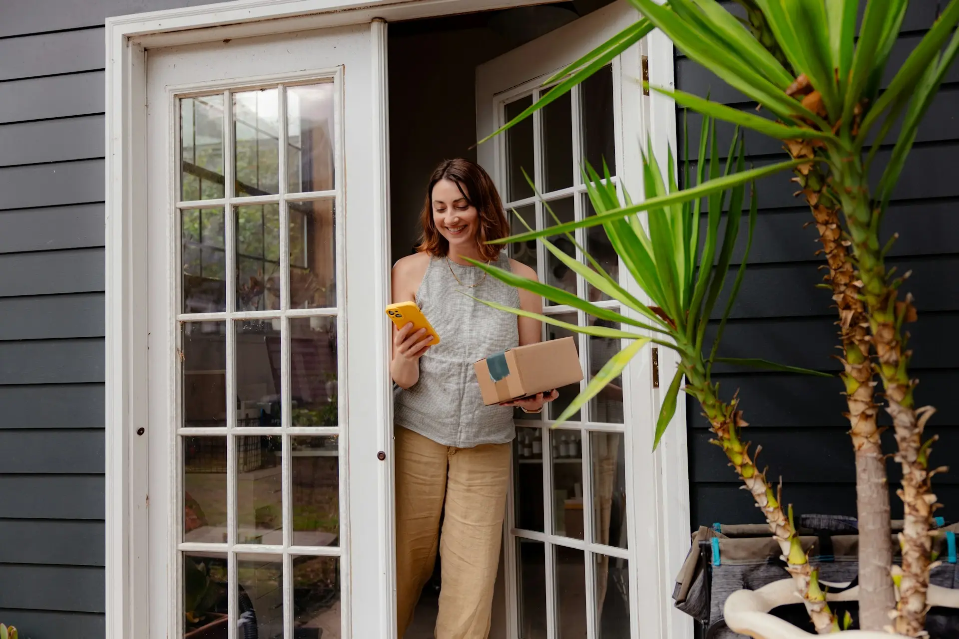
What is the typical e-commerce checkout process?
Long story short, an e-commerce checkout means the process an online shopper goes through to finalize their purchase. Typically, it’s structured as a series of steps every potential customer has to take.
Account login or guest checkout
Creating an account in an e-commerce store usually involves entering an email, password, name, phone number, delivery address, billing address (if different), agreeing to terms and conditions, and marketing opt-ins. It’s a lot of effort, which is why many stores now offer quick options like Google or Facebook login, or let customers skip it altogether with guest checkout.
Shopping cart view
Shopping cart view gives customers a glance at their order before they complete checkout. Your shoppers can double-check quantities, sizes, colors, and prices. It’s also a prime opportunity for upselling and cross-selling — think related items or last-minute add-ons tailored to the cart.
Shipping address
The delivery address is where the order will be delivered, whether it’s a home, office, or out-of-home (OOH) option like service points or parcel lockers. Recognize repeat customers with pre-filled details using emails or cookies and let other shoppers save their shipping details with an easy account setup on the order confirmation page.
Billing address
It's tied to the customer’s payment method information and helps banks verify identity for payment processing. While it’s often the same as the delivery address, that’s not always the case — think gift orders. Some retailers require matching billing and shipping addresses for high-value purchases to prevent credit card fraud.
Delivery details
At this step of the checkout process, customers should see a clear selection of delivery options, including the shipping method, service point address for OOH deliveries, carrier, shipping cost, estimated delivery time, and sustainability labels, e.g., 'fossil-free'.
Payment methods
Credit and debit cards, bank transfers, digital wallets, gift cards, buy-now-pay-later options (BNPL) — accepting more payment methods helps your online store scale globally and optimize checkout conversion.
Order details
Most commonly, it's an order confirmation email sent to customers, e.g., 'We received your order', a type of quick transactional notification triggered when someone completes purchase. It contains a quick summary of the ordered products, filled in automatically. Ideally, it should also be the last step of your actual checkout flow, not just an email.

Common e-commerce cart abandonment reasons
The fact that shoppers went as far as your checkout page doesn’t guarantee sales. Even a tiny mishap on the way can result in shopping cart abandonment, so your checkout conversion optimization should always be an ongoing process. On the other hand, even the slightest improvement can make a difference, especially with a large volume of transactions.
High shipping costs
Unexpected delivery costs are one of the biggest culprits for cart abandonment across the board for e-commerce stores, so it’s crucial to be as transparent as possible from the get-go. We're way past the point where the total cost of the delivery belongs at the very end of the online checkout process.
Forced account creation
Let’s be real, forced account creation's a sure way to lose customers at checkout. Unsurprisingly, it causes 26% of customers abandon carts, simply because it goes against the expectation of purchasing online with ease and using a quick guest checkout.
Delivery takes too long
23% of customers abandon checkout if delivery turns out to be slow, which typically happens to online businesses with limited carrier integrations, especially during peak sales seasons like Black Friday and winter holidays.
Limited delivery options
That's where many customers abandon the checkout page, unless your online store offers diverse delivery options like free delivery, out-of-home (OOH) pickup, climate-smart choices, and named-day delivery. API-based carrier integrations across markets and regions make personalization easy and boost conversions.
"85% of online shoppers say that a poor delivery experience would prevent them from ordering from that online retailer again."
IPSOS, Europe, 2022
Complicated checkout process
Complicated, multi-page checkout flow with overwhelming content, design, layout, and dozens of fields increase the risk of cart abandonment in favor of your competition with a faster and more intuitive checkout process. Online shoppers want to hit the button as quickly and easily as it gets — 22% of online shoppers say they don't want to finish checkout if it the process takes too long.
Limited payment options
Gone are the days of manually entering billing details into a credit card form and waiting for a bank confirmation. Today’s shoppers expect your checkout page to have convenient payment options. Missing their preferred payment method can be a deal-breaker — 13% of online shoppers abandon their carts due to limited payment options.
"54% of customers abandon the checkout process when the payment options are limited to debit and credit cards".
Convertcart, 2025
Best practices for checkout flow optimization
Here are the top strategies and best practices to improve the checkout process on your e-commerce site to reduce cart abandonment and increase conversion rates.
Communicate shipping fees early
Stay ahead at the product search stage by adding your lowest delivery costs to your product data feed on platforms like Google Shopping, TikTok Shop, and Pinterest Shopping. Today’s shoppers care about delivery price and convenience as much as product selection.
At the consideration stage, display shipping costs right on the product page. This helps set clear expectations about the total order value and encourages shoppers to add more items to their cart to qualify for free shipping — turn browsers into paying customers.
How to introduce up-to-date delivery costs in Google Shopping
Optimize your product pages for conversion
E-commerce product pages benefit both online shoppers and merchants. They're supposed to give shoppers enough information to help them assess if the product is right for them, and convince them to make the purchase.
Invest in quality product images and videos, write informative product descriptions with user-friendly sizing or dimension information, introduce the available delivery options, spotlight customer reviews and user-generated content (UGC), try cross-selling and upselling, and of course, pay attention to UX and accessibility, just as with the rest of your website.
Discover the best e-commerce product page with actionable tips
Highlight a guest checkout option
Checking out without an account keeps things quick and easy, especially for first-time or impulse shoppers you can’t afford to lose. You can always capture customer data through their email at checkout, in the order confirmation, or with loyalty perks down the line. Remove friction with a guest checkout and watch your conversions grow.
Show a checkout progress bar
Whether you opt for a one-page checkout or a multi-page process, ensure your shoppers are clear on what to expect. Implement a dynamic checkout progress bar to enhance customer experience with a clear visual guide of the checkout process. It reduces uncertainty, reassures shoppers, and minimizes abandonment by showing exactly where they are and how many steps remain.
Implement a free shipping threshold
Another reason to add a dynamic progress banner. What if your customers paid for delivery? It could cover your shipping costs and even boost profits, especially on low-margin orders. You don’t have to rely solely on free shipping to stay competitive or remove it altogether. For example, if your average order value (AOV) is €30, you can charge a flat delivery fee for orders under €40 and offer free shipping above that using an affordable carrier product. This encourages customers to add more to their cart, making free delivery a win-win.
Spotlight upsell and cross-sell items
Upselling and cross-selling are proven ways to increase AOV and drive revenue, even with fewer sales. Research shows that shopping cart add-ons account for 10–30% of online shopping revenue. Best practices include using AI-powered recommendations based on browsing and purchase history, along with trends like bestsellers, 'frequently bought together' items, seasonal offers, and so on.
Streamline your address form fields
Recognize returning shoppers, enable country-specific auto-complete, and validate delivery addresses to prevent errors. Reduce checkout friction by customizing address forms based on shipping regions and international specifics, if your tech stack allows.
Integrate multiple shipping options
Here's why. Our data from 2024 showed that 32% of shoppers choose the cheapest delivery option, 17% prioritize speed, and 35% have no clear preference. The remaining 15% base decisions on personal preferences like trusted carriers, pickup availability, named-day delivery, or climate-smart options. Notably, 34% are likely to change their delivery preference for repeat purchases.
You can strike just the right balance by offering 3–5 delivery options for each order, giving customers the freedom of choice without overwhelming them. Brands with multiple delivery options see a 27% checkout conversions increase on average. Checkout A/B testing helps you fine-tune your delivery strategy by identifying which offers and layouts work best for your audience in each market and shipping region.
Make an accurate delivery promise
It's not just the speed of delivery that makes for a great shopping experience — it's 'when', an accurate delivery promise, not 'how soon'. Show specific delivery times like 'delivered tomorrow' during the checkout process, or at least set clear expectations with an estimated timeline amid seasonal sales peaks and shipping delays.
Seven tips for getting your online delivery promise right
Enable multiple payment options
Long are gone that days of credit cards as a single payment method, and even a PayPal express checkout. Customer want a fast and straightforward online checkout flow, so make sure to integrate with express payment options like Apple Pay, Google Pay, Shop Pay, as well as BNPL services like Klarna, PayPo or Afterpay, depending on your e-commerce region. Don’t forget a simple way to apply gift cards and voucher codes.
End with a receipt and order details
It turns out that many online retailers miss out on order confirmation, or just massively underuse the opportunity it provides. At best, there's a 'Thank you', maybe an FAQ, and a newsletter signup form in exchange for a 10% discount.
Make sure to confirm the payment instead, sum up the ordered items, review the address details and estimated delivery time, ask for feedback, offer an optional account creation, and provide support information in case of any issues.
E-commerce order confirmation page — best practices
Inspiring e-commerce checkout page examples
Thousands of ecommerce store checkout pages fall short when it comes to great customer experience design. In fact, Baymard Institute’s 2024 UX benchmark of 130+ e-commerce sites revealed that most still have room to improve. If your checkout experience needs a boost, take inspiration from these standout examples.
Sleek, intuitive checkout flow
The best e-commerce checkout designs are straightforward and user-friendly. They provide shoppers with all the information they need to complete their purchase quickly, easily, and free from distractions or unnecessary friction. Your checkout page should reflect strong visual design principles, prioritizing efficiency, accessibility, and a seamless UX. Use elements like hierarchy, scale, and contrast to make the page intuitive and easy to navigate.

Mobile-friendly checkout page
Stats show that mobile commerce is set to account for 59% of all e-commerce sales, in 2025 driven by the ease and speed of shopping on mobile devices. With 75% of consumers preferring mobile checkout it saves time, a responsive mobile design is a must. Keep the mobile checkout button visible, minimize required fields, enable autocomplete, and importantly, avoid links that redirect customers away from the checkout page.

Mini-cart checkout element
In simple terms, a mini cart lets customers review their order summary without leaving the page, keeping the shopping flow smooth. But it’s more than just convenient — it’s a powerful tool to boost AOV with personalized upsell and cross-sell recommendations. When designed right, it can even double as a complete checkout, allowing customers to confirm their order, review shipping details, and check out in just a few clicks.
Delivery-driven checkout page
Price and speed were once thought to be the main drivers of delivery choices for online shoppers, but in 2025, the story is bigger. Giant marketplaces like Amazon have set sky-high expectations for fast, affordable, and convenient delivery. Rethink your brand's checkout flow to offer customers the personalization and convenience they expect, no matter where they are or what they buy. If Amazon Prime can do it, so can you.

One-page checkout flow
Streamlining the checkout process into a single page vs. a multi-page checkout is one of the most effective ways to fight cart abandonment. Fewer steps mean higher conversions. Life's difficult enough, online shopping doesn't have to be. On a single-page checkout, your customers can enter their details, review the order, and complete their purchase all in one place, dodging a dozen of checkout form fields across every step.

One-click checkout process
One-click checkout lets customers complete purchases with a single click, skipping the need to manually enter details like name, email, payment, and shipping information. It simplifies the process, delivering a faster, intuitive checkout experience for your shoppers. However, it requires customers to be logged in with a preferred method of payment. Shoppers may also want to adjust delivery options based on their current order or location.

Real-world e-commerce checkout experience wins you'll love
Ingrid improves the delivery experience by offering personalized delivery options at checkout and providing shoppers flexible delivery choices like home delivery and OOH options. This streamlined approach reduces cart abandonment and ensures timely deliveries, enhancing overall customer satisfaction.
The average order value (AOV) increase by 15%
Once Hatstore, the ultimate online destination for headware, embarked on international expansion, checkout scalability became a challenge. Customers had limited delivery options, and the tech team faced constant updates to parameters like shipping fees. With Ingrid Checkout, Hatstore now offers multiple delivery options presented in a UX-friendly design with precise delivery dates, leading to the AOV increase of 15%.
The checkout conversion rate increase by 15%
Elon, a top Nordic consumer electronics and home appliance retailer, partnered with Ingrid to optimize and scale digital commerce. Today, Elon provides tailored delivery options, including costs, delivery times, methods, and carriers. This delivery-focused approach has boosted conversions by 15% and reinforced Elon’s position as Scandinavia’s leading electronics retailer.
Net margin revenue increase by 11%
Kronans Apotek, one of Sweden's largest pharmacy chains, experimented five delivery cost combinations in e-commerce checkout as a financially sustainable alternative to free shipping. Through data-driven A/B testing, they reduced the volume of low-value orders, resulting in a 14% drop in conversion but an 11% increase in net margin revenue.
Online shopping experience that drives conversion
E-commerce checkout page optimization doesn't just increase customer satisfaction — it's also about your online store's profitability and operational scalability. Turn your customer journey into a source of shopping happiness and a competitive advantage in the next-generation of online retail.

FAQs
What does Ingrid Platform do?
Ingrid is the leading delivery intelligence platform that helps retailers turn delivery from a cost into a commercial advantage. Its modular platform connects retailers, carriers and shoppers across the whole shopping journey — discovery, checkout, tracking, transport, in-store and returns — so every delivery decision drives conversion, margin and loyalty on top of fulfillment and logistics.
How is Ingrid different from other delivery and shipping tools?
Most tools own a single touchpoint: logistics-led platforms stop at booking and labels, and post-purchase tools only start after the sale. Ingrid connects carrier choice to conversion and margin, with built-in A/B testing to prove what works. It gives retailers flexibility, choice and control instead of a fixed, one-size-fits-all setup.
Who is Ingrid for?
Ingrid is built for mid-market and enterprise e-commerce and omnichannel retailers shipping across multiple carriers, markets or delivery methods. Typically heads of e-commerce, logistics and operations leaders who want to turn delivery into a measurable revenue and margin lever. Retailers like Paul Smith, NA-KD, Apoteket, Nordic Nest and Mint Velvet use it to raise AOV, lift conversion, cut delivery-related support, implement direct exchanges, and increase delivery profitability.
Why does delivery intelligence matter?
Product and price used to decide the sale; now delivery does, too. Shoppers increasingly choose by delivery availability — same-day, next-day, pickup or in-store — while AI shopping agents rank retailers on delivery signals rather than branding. Ingrid helps retailers adapt with personalized delivery experience from checkout to returns. Back-end delivery intelligence contains cost and increases revenue, so delivery becomes a competitive advantage.
Related blog posts

Delivery, the most overlooked growth lever in e-commerce
Why delivery decides trust, conversion and repeat purchase, especially in agentic shopping.

How to choose a multi-carrier delivery platform: a buyer's guide for enterprise e-commerce
Carrier orchestration, checkout impact, delivery accuracy, analytics, and cost control.

EU Right of Withdrawal: Your implementation guide for 2026
How to choose the implementation path that fits your stack and the pitfalls to watch out for
