
Do you need a receipt? E-commerce order confirmation page template

Anastasiia Starchenko

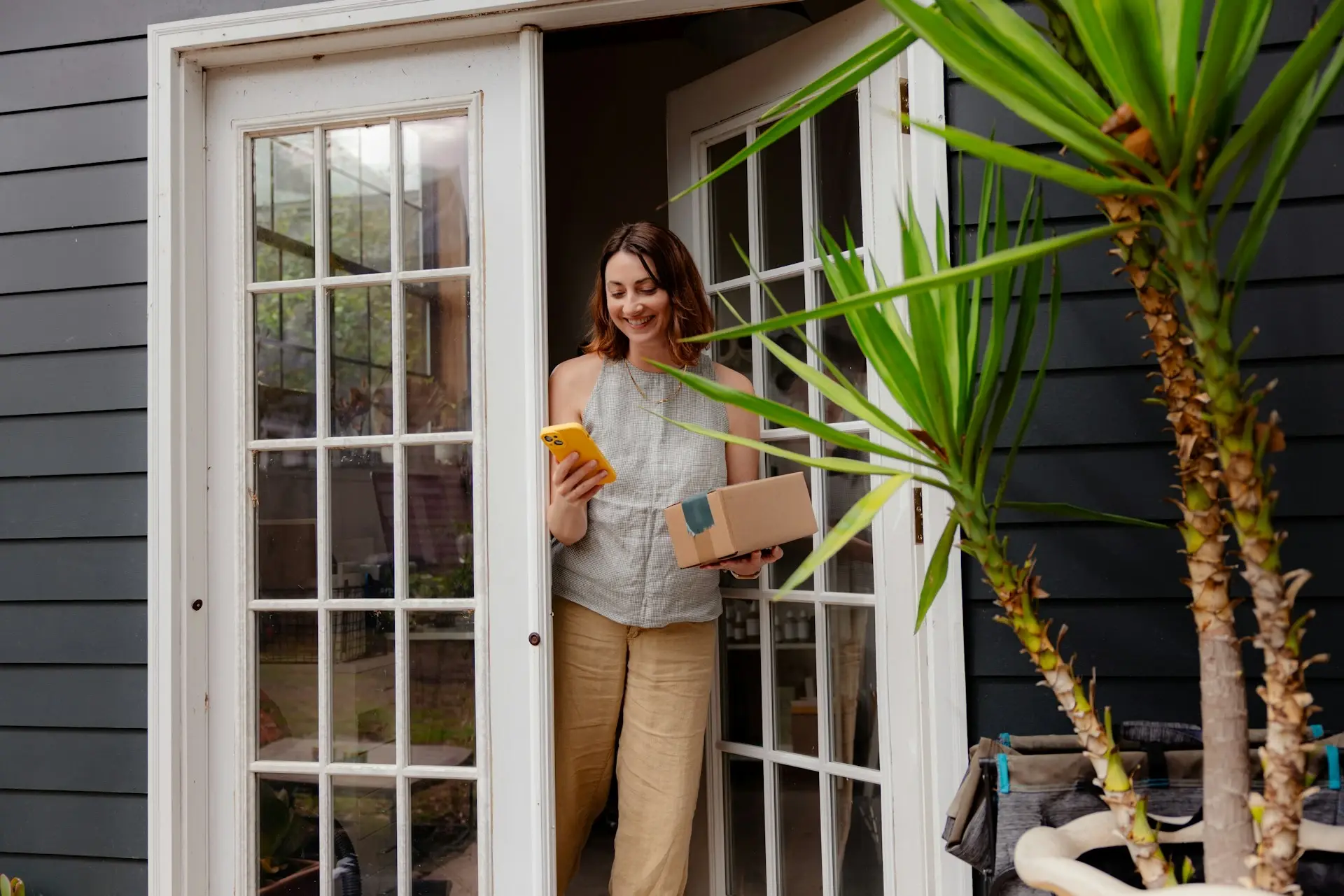
Have you noticed? If you pay attention when shopping online, you will rarely see a detailed overview of your order after finalizing it. You might think that we're exaggerating — at first, we thought so, too — but the recent online shopping spree we went on proved this point entirely.
It turns out that many online retailers miss out on order confirmation, or just massively underuse the opportunity it provides.
At best, there is a note saying 'thank you', maybe some frequently asked questions, and a few social sharing buttons allowing customers to brag about their purchase to social media followers.

Thanks for the money, bye now
What if the customer made a mistake when filling in the address form, used the wrong apartment number, or chose the wrong parcel locker? Such mistakes can cost both online retailers and carriers some serious money — and frustrate the customer in the process.
In fact, most missed delivery attempts are caused by address mistakes, and there’s research to back it up. According to the Fixing Failed Deliveries study from Loqate, when addresses are inaccurate or incomplete, 41% of deliveries are delayed and 39% simply fail.
Failed deliveries cost you a fortune
There’s no denying that order fulfillment failure can be costly, and fixing the issue as early as possible is in everyone’s interest. Instead of just thanking your customers for the order, why not show them a detailed receipt with ordered products, address information, payment method, and chosen delivery option?
This way, you can help your customers double-check all the information once more, and offer the possibility to introduce last-minute changes to delivery instructions before the order is processed further.

Best practices for your e-commerce order confirmation page
It’s difficult to argue that converting customers is the primary goal for any e-commerce business. Yet, customer expectations, along with the importance of after-sales care, are steadily growing. The confirmation page is one of the checkout touchpoints you can easily improve for a better shopping experience.
In many cases, it comes down to actually… having the 'order complete' page at all. So, instead of showing generic thank you messages, it’s time to use your order confirmation page to the fullest. Here’s how.
1. Confirm the payment
When designing a proper order complete page, the least you can do is confirm that the payment actually went through. After all, showing a confirmation is the main reason why such pages exist, but sometimes there’s just no reassurance at all.
Sometimes the message is pretty vague or shown quickly before redirecting the shopper elsewhere. The lack of the order complete page actually forces customers to rely on getting an order confirmation email instead, which usually takes some time to reach the inbox.

2. Sum up ordered items
Another way to boost customer confidence is by providing a clear order summary, allowing customers to confirm they've selected the right items, sizes, and colors. If there’s an issue, a quick support ticket beats a costly return before the order even reaches the customer.
What’s even better at this point is providing the option to still add new items to the same order and offer split delivery, for example. This can make things easier for those shoppers who just realized they forgot to buy something they needed or those who just want to add more items last minute.

3. Mention the address details and delivery time
As already mentioned, most missed delivery attempts are caused by address mistakes, and fixing even the smallest errors after the order is processed tends to be costly and complicated. The fewer address mistakes, the better.
Reminding shoppers what delivery option they chose and whether they selected the right parcel locker or home delivery address, for example, helps your customers double-check the delivery information and the estimated delivery time, so they know when to expect the parcel.

4. Start order tracking early
To feature all delivery information and more, you can integrate the Ingrid Receipt into your 'thank you' page. The widget gives your customers full transparency and makes it the first step in the customer's delivery experience journey. Why wait until the order is shipped?
The contents of the cart, prices, including discounts, the recipient's address, and the chosen delivery option can all be shown in detail and serve as order confirmation. This means no more blank pages and generic names that only add to the confusion.
Here's the kicker. Use the Receipt to upsell delivery options even after the final purchase. Offer shoppers a chance to upgrade their shipping choice for added convenience, and gather valuable feedback on your delivery offering.

5. Ask for feedback
While the checkout process is not the best place to distract potential customers from making the purchase, the order confirmation page is where you can actually ask for some information and get feedback about the overall shopping experience.
It might not seem like much, but surveying customers is a great way to assess their overall satisfaction with your store and keep optimizing the checkout process. It also shows that you care about their experience — especially if you act upon the received feedback. The worst that can happen is they will just ignore the survey. No hard feelings!

6. Recommend other items
Don’t get us wrong. Cross-selling is great, but interrupting the checkout flow with recommended products popping out on a screen every five minutes or so can easily annoy your customers and make them abandon the cart eventually.
It doesn’t mean that you shouldn’t do any cross-selling though. Similarly to feedback surveys, you can choose to move your cross-sell offers to the 'receipt' page instead. Especially if you can allow customers to still add items to their order after the purchase, without the need to fill in all the checkout forms again.
No matter where you choose to display your cross-sell deals, choose them wisely. Think complementary items, not necessarily similar ones. If I just bought a sofa, I’m not really looking for another one to buy right now, although I might be tempted to add a nice coffee table to the order.

7. Encourage the next purchase
Even though a seamless shopping experience is the no. 1 factor driving customer loyalty and repeat purchases, it wouldn't hurt to incentivize the next order. Featuring discount codes or special deals on your order confirmation page — later followed up by a confirmation email — is the easiest way to do so.
If you’re not convinced to give them out 'for free', you can simply offer such perks in exchange for joining the loyalty program, creating an account in your store, or sharing a referral with a friend through social media.

8. Mention the return process
Building trust and ensuring a smooth shopping experience throughout the e-commerce customer journey ends with a shopper-focused return policy. Keep it clear and straightforward, covering essentials like the return window, any fees, and easy steps for initiating a return. Make it easy on your customers by communicating it upfront on the confirmation page so they don’t have to search for it later.
Returns and cancellation policies included at this stage can help you retain sales and loyal customers by offering direct product exchanges, customer-to-customer (C2C) exchanges, gift cards with small bonus incentives instead of refunds, encouraging shorter return windows to reduce your return lead time, and much more.

9. Enable account creation
Once again, anything that gets in the way of purchase — such as forced account creation during the checkout process — can easily lead to cart abandonment. Nobody likes to be forced to do anything, plus plenty of online shoppers just despise keeping numerous accounts, our team included. Especially the ones that come with numerous emails after the signup.
Placing the account creation form on the order confirmation page makes it less intrusive. When optional, only engaged shoppers will sign up. To boost signups, consider offering incentives like discounts or highlighting perks such as faster checkout for account holders.

10. Provide contact information
Technically, if you offer order tracking details right from the beginning, the chances of getting a lot of inbound support issues are pretty low. Still, your e-commerce business needs experienced support reps to handle unexpected issues, like fixing address mistakes — if it’s not possible for your customers to do it themselves — or handling delivery delays.
In such cases, it really helps to highlight the contact information of your support team, making it easy for customers to reach out if needed. You can also embed a contact form or FAQ section to address common issues before they arise.

E-commerce order confirmation page template
Ready to design your order confirmation page? Use the template below or embed Ingrid Receipt to easily show relevant information. Book a demo to learn how we can help you.
Thank you ☺ message
Thank the customer with a branded message, confirm the payment, provide the order ID, and mention that the order confirmation email is on its way.
Delivery details
Include the delivery option, address information, and estimated delivery time. If you're a team of e-commerce pros, include a shipping upsell to recommend your customers a more personalized delivery offer.
Order summary
Sum up ordered items, including product name, quantity, color, size, price, shipping fees, taxes, and discounts.
Return policy
Keep it clear and straightforward, covering essentials like the return window, any fees, and easy steps for initiating a return.
Feedback survey
Ask for feedback on the shopping experience so far. You're selling to human shoppers such as yourself, checkout optimization will help you boost revenue and customer retention in the long run.
Account creation form
Encourage customers to create an account for future purchases. Give something in exchange — mention a faster checkout process next timer around, personalized product offers, or an instant discount code.
Recommended products
Show complementary products or services but keep them relevant and personalized according to individual preferences, market trends, and your brand's bestselling items.
Customer support information
Add customer support contact details to reach out in case of any issues.
Shopping as it's meant to be
Use small, seemingly inconsequential changes in your shopping experience to turn window shoppers into buyers with.
Remember, your brand's shopping experience doesn't start at checkout, nor does it end there.
Product discovery, consideration, order, purchase confirmation, proactive tracking, personalized delivery, and a possible return — all are essential parts of the customer journey and your e-commerce strategy.
Explore our bite-sized, hands-on strategies for optimizing your e-commerce delivery ✌🏼 2024 Playbook

FAQs
When does the 14-day withdrawal clock start?
For goods, the 14-day period begins the day after the shopper takes physical possession of the order, which in practice means the day after delivery. If multiple items in one order are delivered separately, the clock starts the day after delivery of the last item.
Is the withdrawal the same as returns?
No. The right of withdrawal is a statutory right under EU law; a return is a commercial process. Labels like ‘Return’ or ‘Get a refund’ do not qualify on their own — the withdrawal option has to be clearly and unambiguously labeled as such. Some teams are leaning toward separate flows, others toward one combined flow. Both can work, but only if withdrawal remains a clearly labeled, unobstructed step within it.
Do shoppers have to give a reason to withdraw?
No. Providing a reason is not required by law. Reason fields in the withdrawal flow must be optional and must not delay or block completion of the withdrawal. Designing the interface in a way that pressures shoppers to provide a reason is treated as a manipulative pattern under the directive.
Does this apply to retailers based outside the EU?
Yes — if they sell to EU shoppers. The directive applies to distance contracts with EU shoppers, regardless of where the retailer is established.
Related blog posts

EU Right of Withdrawal: Your implementation guide for 2026
How to choose the implementation path that fits your stack and the pitfalls to watch out for

EU Right of Withdrawal: What retailers need to know in 2026
Here's what the rule says, what counts as compliant, and where most teams are stuck.

How OSPREY LONDON turned delivery into a profit driver
A conversation with Ben Jones, Head of E-commerce and Technology at OSPREY LONDON
